

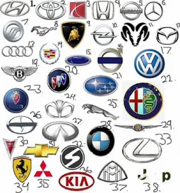
Every car emblem was designed to say something about the company. Once you learn the common ideas behind them, you can understand a lot about a brand from a single glance. Here are eight well-known examples.
1. Mercedes-Benz: the three-pointed star. The popular explanation is that the three points stand for the company’s ambition to motorize land, sea and air. The star inside a ring has been part of the brand’s identity for over a century.
2. Audi: four rings. The rings come from 1932, when four German manufacturers (Audi, DKW, Horch and Wanderer) merged to form Auto Union. Each ring represents one of the founding companies, and the logo still shows that union.
3. BMW: the roundel. The blue and white quarters reflect the colors of Bavaria, where the company is based. A widespread story says the logo shows a spinning propeller, because BMW built aircraft engines. That idea came from a 1929 advertisement, not from the original design.
4. Chevrolet: the bowtie. One of the most recognizable shapes in American motoring. Its exact origin is disputed, with several stories attributed to the company’s founders, so treat any single origin tale with care.
5. Toyota: three overlapping ovals. The two crossing ovals in the center can be read as the hearts of the customer and the company, and the larger oval around them as the world embracing Toyota. The design also uses the letters of the brand name.
6. Subaru: the Pleiades. “Subaru” is the Japanese name for the Pleiades star cluster. The logo shows six stars, one large and five smaller, which relates to the companies that merged to form the parent firm.
7. Volvo: the iron mark. The circle with an arrow pointing up and to the right is the ancient alchemical symbol for iron. It was chosen to suggest strength and Sweden’s steel tradition.
8. Hyundai: a stylized H. The slanted H looks like the company’s initial, and it is also meant to show two people shaking hands, a customer and the company.
Patterns to notice. Most emblems fall into a few groups: heraldry and coats of arms, animals, stars and celestial symbols, initials and letters, and abstract geometry. Over the last few years many brands have also moved to flat, simple versions that work better on screens, which
is why older chrome-style badges are disappearing.
Where to learn more. If you want to browse brand emblems side by side, with notes on how each one changed over time, car logos and their meanings are collected in one catalog on VehicleLogos. It is a convenient reference when you are shopping
for a used car or simply curious about a badge you saw on the street.
Next time you walk through a parking lot, try reading the badges. You will probably find that most of them have a story.